You can customize the appearance of the Stripe payment button using custom CSS code. In this tutorial I will show you some examples so you can see how it works.
You can edit a product in the Stripe payments plugin and specify a CSS class to be used for the payment button.
Customizing the appearance is a two step process:
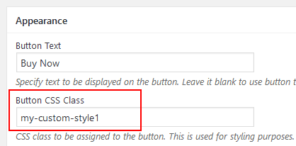
Step 1) Enter a CSS class name in the following interface of the plugin and save the product (try to use a unique CSS class name):
Stripe Product -> Appearance -> Button CSS Class
Lets say, you specified “my-custom-style-1” as the CSS class.
Step 2) Now, you can define the CSS code for that class.
Enter the custom CSS code in the following area of your site:
WP Admin Dashboard -> Appearance -> Customize -> Additional CSS
I have designed a custom button and the CSS code for it looks like the following (you can use it to see how it works):
.my-custom-style-1 {
	-moz-box-shadow: 3px 4px 0px 0px #1564ad;
	-webkit-box-shadow: 3px 4px 0px 0px #1564ad;
	box-shadow: 3px 4px 0px 0px #1564ad;
	background:-webkit-gradient(linear, left top, left bottom, color-stop(0.05, #79bbff), color-stop(1, #378de5));
	background:-moz-linear-gradient(top, #79bbff 5%, #378de5 100%);
	background:-webkit-linear-gradient(top, #79bbff 5%, #378de5 100%);
	background:-o-linear-gradient(top, #79bbff 5%, #378de5 100%);
	background:-ms-linear-gradient(top, #79bbff 5%, #378de5 100%);
	background:linear-gradient(to bottom, #79bbff 5%, #378de5 100%);
	filter:progid:DXImageTransform.Microsoft.gradient(startColorstr='#79bbff', endColorstr='#378de5',GradientType=0);
	background-color:#79bbff;
	-moz-border-radius:5px;
	-webkit-border-radius:5px;
	border-radius:5px;
	border:1px solid #337bc4;
	display:inline-block;
	cursor:pointer;
	color:#ffffff;
	font-family:Arial;
	font-size:17px;
	font-weight:bold;
	padding:12px 44px;
	text-decoration:none;
	text-shadow:0px 1px 0px #528ecc;
}
The buy button now looks like the following:

Additional Button Styles (CSS Code Examples)
You can use the following custom CSS code to get 3 different styles (7 different colors for each).
The CSS Code
.aspButton{font-family:"Helvetica Neue",Helvetica,Arial,sans-serif;line-height:1.5;letter-spacing:normal;font-weight:normal;text-decoration:none;text-transform:none;transition:none;-webkit-touch-callout:none;-webkit-tap-highlight-color:transparent;-webkit-user-select:none;-moz-user-select:none;-ms-user-select:none;-o-user-select:none;user-select:none}
.aspButton:active{outline:0;box-shadow:none}
.aspButton:focus{outline:0}
.aspButton.fancy{padding:7px 15px;border-radius:20px 3px 20px 4px;moz-border-radius:20px 3px 20px 4px;-webkit-box-shadow:0 0 1px rgba(0,0,0,0.7);-moz-box-shadow:0 0 1px rgba(0,0,0,0.7);box-shadow:0 0 1px rgba(0,0,0,0.7);font-size:16px}
.aspButton.biggy{font-weight:bold;padding:8px 18px;border:solid 0 #000;border-radius:5px;moz-border-radius:5px;font-size:18px}
.aspButton.simple{border-radius:5px;padding:5px 13px;font-weight:bold;font-size:14px;font-family:"Helvetica Neue",Helvetica,Arial,sans-serif}
.aspButton.orange{color:#fff;border:solid 1px #ff3503;background:#ff8c00;background:-moz-linear-gradient(top,#ff8c00 0,#ff3503 100%);background:-webkit-linear-gradient(top,#ff8c00 0,#ff3503 100%);background:-o-linear-gradient(top,#ff8c00 0,#ff3503 100%);background:-ms-linear-gradient(top,#ff8c00 0,#ff3503 100%);background:linear-gradient(top,#ff8c00 0,#ff3503 100%);filter:progid:DXImageTransform.Microsoft.gradient(startColorstr='#ff8c00',endColorstr='#ff3503',GradientType=0)}
.aspButton.orange:hover{background:#ff8c00}
.aspButton.orange:active{background:#ff3503}
.aspButton.green{color:#fff;border:solid 1px #288c1a;background:#31fa1e;background:-moz-linear-gradient(top,#31fa1e 0,#30ab00 100%);background:-webkit-linear-gradient(top,#31fa1e 0,#30ab00 100%);background:-o-linear-gradient(top,#31fa1e 0,#30ab00 100%);background:-ms-linear-gradient(top,#31fa1e 0,#30ab00 100%);background:linear-gradient(top,#31fa1e 0,#30ab00 100%);filter:progid:DXImageTransform.Microsoft.gradient(startColorstr='#31fa1e',endColorstr='#30ab00',GradientType=0)}
.aspButton.green:hover{background:#31fa1e}
.aspButton.green:active{background:#30ab00}
.aspButton.blue{color:#fff;border:solid 1px #1a528c;background:#0064ab;background:-webkit-linear-gradient(top,#1ebdfa 0,#0064ab 100%);background:-moz-linear-gradient(top,#1ebdfa 0,#0064ab 100%);background:-o-linear-gradient(top,#1ebdfa 0,#0064ab 100%);background:-ms-linear-gradient(top,#1ebdfa 0,#0064ab 100%);background:linear-gradient(top,#1ebdfa 0,#0064ab 100%);filter:progid:DXImageTransform.Microsoft.gradient(startColorstr='#1ebdfa',endColorstr='#0064ab',GradientType=0)}
.aspButton.blue:hover{background:#1ebdfa}
.aspButton.blue:active{background:#0064ab}
.aspButton.black{color:#fff;border:solid 1px #000;background:#000;background:-webkit-linear-gradient(top,#797979 0,#000 100%);background:-moz-linear-gradient(top,#797979 0,#000 100%);background:-o-linear-gradient(top,#797979 0,#000 100%);background:-ms-linear-gradient(top,#797979 0,#000 100%);background:linear-gradient(top,#797979 0,#000 100%);filter:progid:DXImageTransform.Microsoft.gradient(startColorstr='#797979',endColorstr='#000',GradientType=0)}
.aspButton.black:hover{background:#797979}
.aspButton.black:active{background:#000}
.aspButton.red{color:#fff;border:solid 1px #f00;background:#ff8c00;background:-moz-linear-gradient(top,#f00 0,#8e0000 100%);background:-webkit-linear-gradient(top,#f00 0,#8e0000 100%);background:-o-linear-gradient(top,#f00 0,#8e0000 100%);background:-ms-linear-gradient(top,#f00 0,#8e0000 100%);background:linear-gradient(top,#f00 0,#8e0000 100%);filter:progid:DXImageTransform.Microsoft.gradient(startColorstr='#ff0000',endColorstr='#8e0000',GradientType=0)}
.aspButton.red:hover{background:#f00}
.aspButton.red:active{background:#8e0000}
.aspButton.gold{color:#fff;border:solid 1px #c8a000;background:#ffd700;background:-moz-linear-gradient(top,#ffd700 0,#c8a000 100%);background:-webkit-linear-gradient(top,#ffd700 0,#c8a000 100%);background:-o-linear-gradient(top,#ffd700 0,#c8a000 100%);background:-ms-linear-gradient(top,#ffd700 0,#c8a000 100%);background:linear-gradient(top,#ffd700 0,#c8a000 100%);filter:progid:DXImageTransform.Microsoft.gradient(startColorstr='#FFD700',endColorstr='#c8a000',GradientType=0)}
.aspButton.gold:hover{background:#ffd700}
.aspButton.gold:active{background:#c8a000}
.aspButton.silver{color:#696869;border:solid 1px #c0c0c0;background:#c0c0c0;background:-moz-linear-gradient(top,#fff 0,#c0c0c0 100%);background:-webkit-linear-gradient(top,#fff 0,#c0c0c0 100%);background:-o-linear-gradient(top,#fff 0,#c0c0c0 100%);background:-ms-linear-gradient(top,#fff 0,#c0c0c0 100%);background:linear-gradient(top,#fff 0,#c0c0c0 100%);filter:progid:DXImageTransform.Microsoft.gradient(startColorstr='#ffffff',endColorstr='#c0c0c0',GradientType=0)}
.aspButton.silver:hover{background:#fff}
.aspButton.silver:active{background:#c0c0c0}
The CSS Class to Use in Product Configuration
Once the above mentioned CSS code is added to your site, you can use the following CSS class names in the product configuration:
Button CSS Class: aspButton simple red
It will produce the red button styled like in the following screenshot:
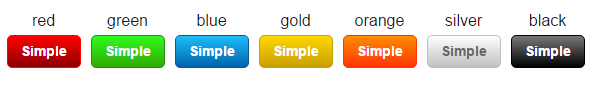
You can replace “red” with one of those colors you can see on the screenshot. For example, to get gold button, following CSS Class should be used: aspButton simple gold
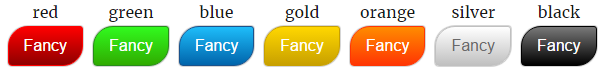
Button CSS Class: aspButton fancy
It will produce the the button style shown in the following screenshot:
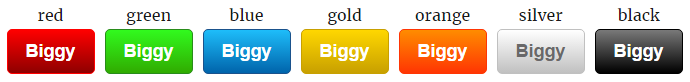
Button CSS Class: aspButton biggy
It will produce the the button style shown in the following screenshot: