You can use CSS tweaks to customize the look and feel of the payment popup that appears after the customer clicks on any of your Stripe Payments Plugin payment buttons. The CSS payment popup field within the settings menu of the plugin, allows you to complete customization without the need to modify any code. This means even those with little to no developer knowledge can use this plugin and have custom popup checkouts.
Prior to applying any CSS to your Stripe Payments Popup, it will look like the following example:
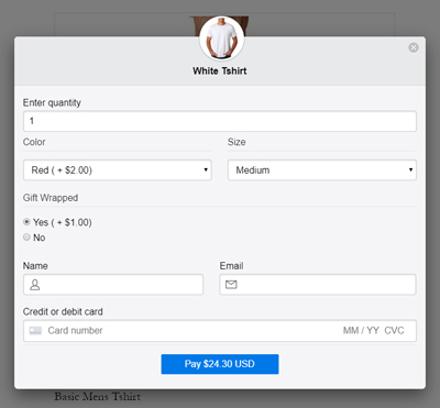
The background is grey and the payment button is blue with white text. While this color scheme may work fine for the majority of websites, if you wish for the popup to have a certain ‘feel’ that fits in with your website, you may wish to add some CSS tweaks.
Make sure to review your CSS tweaks to ensure that the text is still visible to customers when clicking on the payment button. For instance, if you alter the payment button background to ‘white’, then you’ll also need to alter the color of the payment button text so that it is visible.
How Can I Add CSS Tweaks to my Stripe Payments Popup Window?
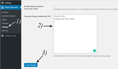
To add CSS tweaks that will apply to the payment window of your products complete the following:
- Choose the CSS tweak that you will apply from the section below and copy it. Alternatively, you may know other CSS tweaks that are not listed.
- Click on the ‘Stripe Payments‘ ‘Settings‘ menu and then on the ‘Advanced Settings‘ tab.
- Paste the CSS tweak in the ‘Payment Popup Additional CSS‘ field.
- Click the ‘Save Changes‘ button.
- Once you click on your ‘Buy Now‘ button on the front end of your website, you should see the CSS tweak that has been applied to the checkout popup window.
Stripe Payments Popup CSS Tweaks
Below you can find a number of CSS tweaks that will alter the appearance of your Stripe Payments Plugin popup window. This is the popup window where your customers will enter their payment details to complete a transaction.
Customizing the Background Color of the Submit Button
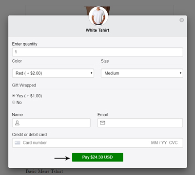
Use the following CSS tweak to alter the background color of the payment button that appears on the Stripe Payment Popup Checkout:
#submit-btn {
background-color: green;
}
Example Screenshot Using the Above CSS Tweak:
Customizing the Font Color and Style of the Submit Button
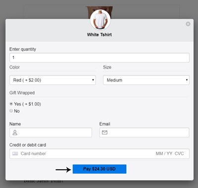
Use the following CSS Tweak to alter the color and style of the payment button text that appears on the popup window:
#submit-btn {
color: black;
font-weight: bold;
}
Example Screenshot Using the Above CSS Tweak:
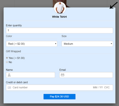
Customizing the Background Color of the Popup Window
Use the following CSS Tweak to change the background color of your Stripe Payments Popup Window:
#modal-header, #modal-body{
background-color: #DBEBFF;
}
Example Screenshot Using the Above CSS Tweak:
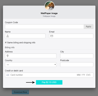
Customizing the Submit Button Color on a Per Product Basis
While you can universally apply a CSS Tweak to the payment popup which will apply for all products, you can also apply tweaks on a per-product basis. This means the payment button for one product can differ from another. To achieve this, you will simply need to change the product ID (1234) in the example below to the actual ID of your product:
#product-1234 #submit-btn {
background-color: #10DEDA;
}
Example Screenshot Using the Above CSS Tweak:
Customizing the Payment Popup Using Multiple CSS Tweaks
You can combine multiple CSS Tweaks to bring to life a payment popup window that fits with the aesthetics of your website. In the following example, we used a custom-background color, a black button background with the default white button text color.
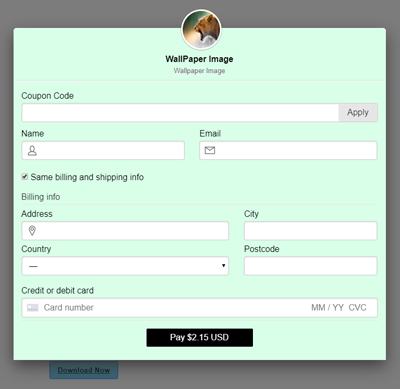
The following CSS was used to achieve the above payment popup window:
#modal-header, #modal-body{
background-color: #d9ffe8;
}
#submit-btn {
background-color: black;
}
If you wish to alter the color of your Stripe Payments ‘Buy Now’ buttons, take a look at the following documentation.